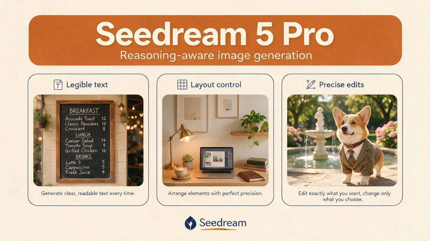
A short prompt guide for Seedream 5 Pro
How to get the most out of BytePlus Seedream 5 Pro in the Maejik studio — reasoning-aware prompts, infographics and posters, multilingual text, and precise region edits.
Seedream 5 Pro is BytePlus’s most controllable image model — a reasoning engine that thinks before it draws. It runs a planning pass over your prompt first, which is why it rewards a clear brief with precise layout, legible text in more than a dozen languages, and composition it actually holds to. Where other models improvise the arrangement, Pro places things where you asked. Here’s how to get the most out of it.
The five things that matter most
1. Write the brief, not the keywords. Pro interprets intent. State the purpose of the image up front — poster, infographic, packaging, diagram — then the subject, layout, text, style, and lighting. Because it reasons before rendering, a multi-constraint prompt pays off instead of confusing it.
- Good: Design a conference schedule poster. A bold title band across the top, three time-slot columns beneath it, and a footer with the venue address.
- Avoid: Conference poster, schedule, times, venue, modern.
2. Be explicit about position. This is where Pro pulls ahead. It understands spatial language — top-left, centred, along the bottom edge, the left third — and it holds to it. If layout matters, describe it like you’re briefing a designer.
- Good: A product hero shot with the bottle centred, the tagline set directly beneath it, and a small certification badge in the bottom-right corner.
- Avoid: A bottle, a tagline, and a badge somewhere.
3. Quote every word you want rendered. Pro’s text rendering is a headline feature, and it works in roughly fourteen languages — but it needs to know what’s text and what’s description. Use double quotes, name the typeface style, and keep each rendered phrase short for reliability.
- Good: A café A-board with the headline “Fresh Roast Daily” in a bold condensed sans, and “Open 7–4” beneath it in a lighter weight.
- Avoid: A café sign about fresh roast, open 7 to 4.
4. Describe one composed image. Pro is built for a single, deliberate scene — not a set. If you need a sequence or several variations of the same idea, that’s Seedream 5 Lite’s job, and batching is handled by the count control in the studio, not the prompt. Don’t ask Pro for “a series of” or “three versions of” — ask for the one image you want, done well.
5. Name the style precisely, or attach a reference. “Modern” is vague. “Flat vector illustration, two-colour palette, generous negative space, geometric sans-serif labels” is not. When words run out, attach a reference image and tell Pro what to pull from it.
Text-to-image: infographics, posters, and diagrams
This is Seedream 5 Pro’s strongest suit. Dense, information-rich visuals — infographics, data-visualisations, posters, packaging, org charts — come out with the text legible and the hierarchy intact, because the reasoning pass organises the information before it draws.
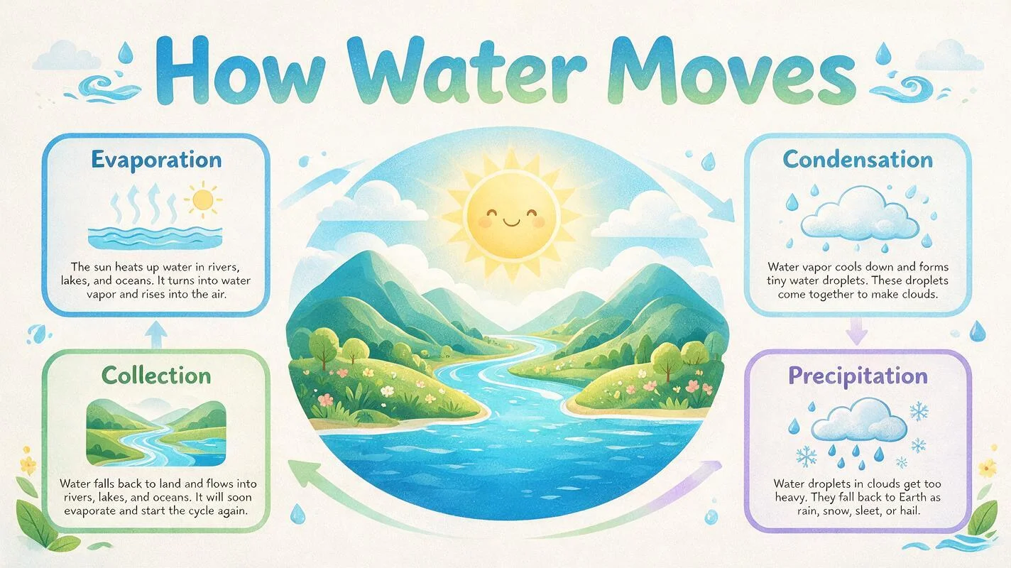
Prompt: A clean, modern infographic titled “How Water Moves” explaining the water cycle for a primary-school classroom. Arrange four labelled stages around a central illustration — “Evaporation”, “Condensation”, “Precipitation”, “Collection” — with subtle directional arrows showing the flow between them. Warm pastel palette, friendly geometric icons, a hand-set sans-serif headline across the top.
For editorial and product scenes, describe every element you care about and where it sits. Pro will arrange them faithfully — but it works from your layout, so give it one.
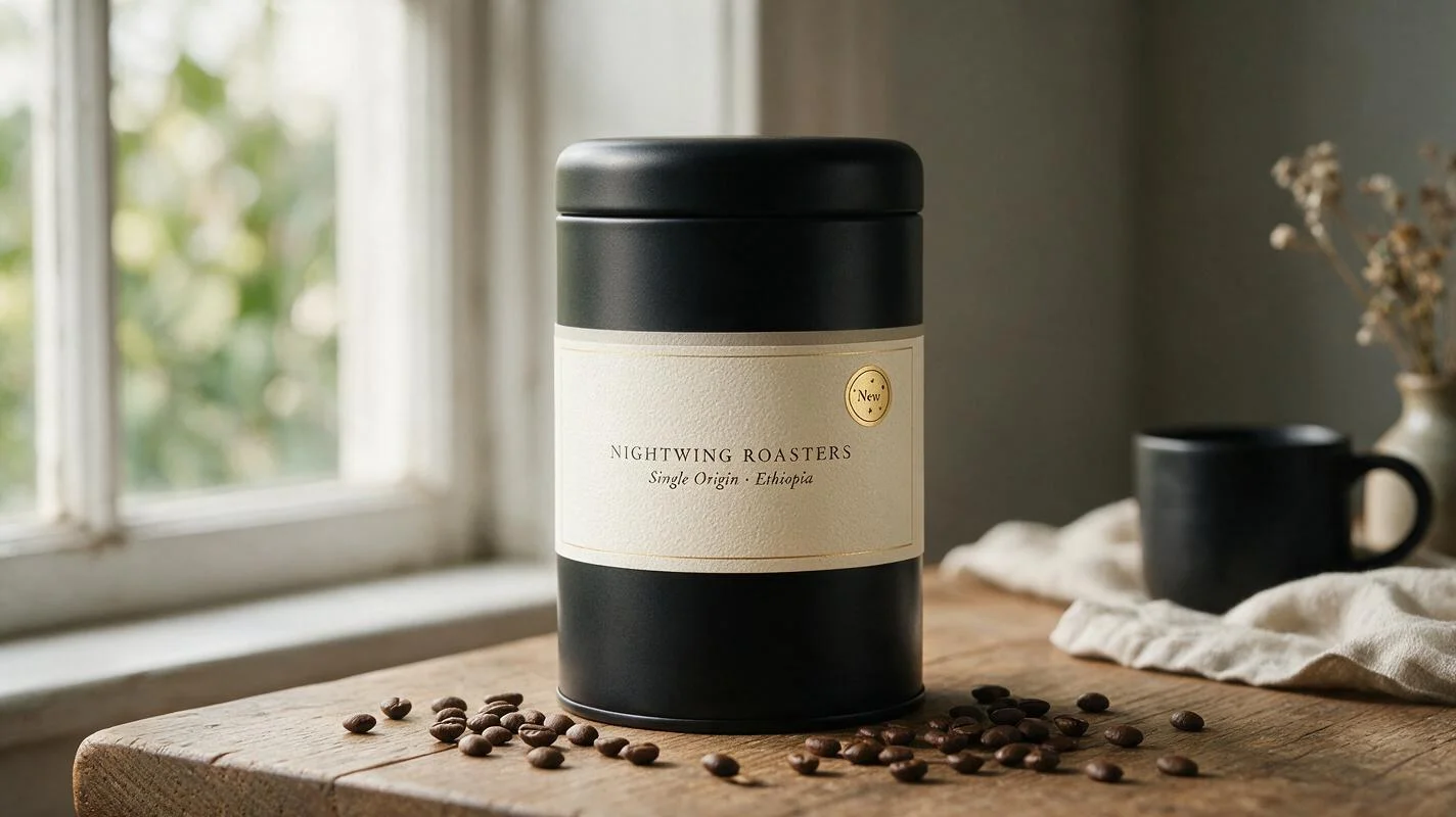
Prompt: Editorial product photograph of a matte-black coffee tin, centred on weathered oak, soft window light from the left. The label reads “NIGHTWING ROASTERS” in small-caps serif, with “Single Origin · Ethiopia” set beneath it in a finer italic. Scattered coffee beans across the lower third, a folded linen napkin in the bottom-right. Shallow depth of field, magazine commercial quality.
Multilingual text in a single image
Pro renders native text across many scripts — Latin, Arabic, Japanese, Korean, and more — inside the same composition. If you need one asset that speaks more than one language, say which text goes where and in which language.
Prompt: A minimalist welcome banner for an international event. The word “Welcome” centred in a bold sans-serif, with “ようこそ”, “أهلاً”, and “Bienvenue” set in a smaller weight in a row beneath it. Soft gradient background, generous margins.
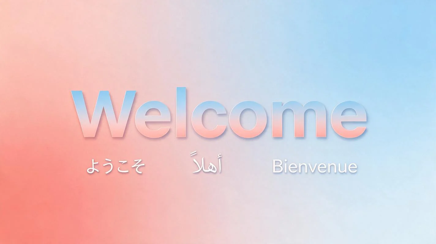
Keep each phrase short and quoted, and name the language if the script could be ambiguous. That’s usually enough to get clean, correctly-shaped glyphs without a manual typesetting pass.
Region-precise editing and layers
In the studio, click any past generation to use it as the input for your next prompt. Pro is designed for precise editing rather than re-rolling — name the change and what to preserve, and it keeps the rest of the frame steady.
- Add: Add a small “New” badge to the top-right corner of the packaging. Keep the label, colours, and layout exactly as they are.
- Remove: Remove the price sticker from the jar. Keep the label and lighting identical.
- Replace: Replace the headline text with “Autumn Menu” in the same typeface and position. Change nothing else.
- Modify: Recolour the background band from teal to burnt orange. Preserve every element’s position and the text.
For a specific spot, point at it: upload an annotated version with an arrow, box, or circled area and reference it directly — “place the logo where the red box is marked.” Pro reads those visual cues alongside the text. It can also separate a composition into layers, so elements stay independently editable rather than baked into one flat image.
Reference-based and multi-image prompts
Attach up to ten reference images and assign each one a role. Pro honours explicit assignments — label them Image 1, Image 2, and give each a noun for what it contributes. Remember it’s still composing one scene, not merging them into a set.
Prompt: Compose a single product poster: place the bottle from Image 1 on the marble surface from Image 2, lit to match Image 2’s soft side light. Add the headline “Pure & Simple” centred above the bottle in an elegant serif. Preserve the bottle’s label exactly.
A few common shapes:
- Subject + environment: Place the product from Image 1 onto the scene in Image 2, matching its existing lighting.
- Style transfer: Render the layout of Image 1 in the illustration style of Image 2.
- Sketch to render: Follow the layout of the wireframe in Image 1; render it as a finished poster in the style of Image 2.
Resolution: 1K and 2K in Maejik
Seedream 5 Pro renders at 1K and 2K in the Maejik studio — 1K for quick drafts and lighter cost, 2K for finished, detail-rich design work. Set the tier in the studio’s controls; don’t write it into the prompt.
If you need 4K or print-ready output, reach for Seedream 4.5 instead — it renders full 4K and leans more photographic. Not sure which to pick? See Seedream 5 Pro vs Seedream 4.5.
If you get stuck
Hit the prompt touch-up button in the studio. It rewrites your prompt into the kind of structured, intent-led language Pro responds to — quoting your rendered text, making the layout explicit, and tightening loose phrasing — without changing what you asked for. Use it as a starting point and tweak from there.
Bring a prompt and sign up — new accounts start with free credits, no card required.